As you know by now, TLSM is inviting anyone with special knowledge about Sindy, to share it here on the website. And now TLSM is very proud to have Matthew Hadley sharing his information about the package design!
All the photos are taken by Matthew Hadley and they are from his own Sindy Collection.
Sindy – Changing with the times 1983-1986, by Matthew Hadley
“Sindy has always kept up to date with changing trends and styles, and in 1983 her packaging and famous logo were given a dramatic overhaul, rebranding her in order to stay ahead, compete and keep in step with the changing pace of the 1980’s.
Sindy was one of many successful 1960’s and 1970’s products made by British companies, who were facing uncertainty at the turn of the decade. Toys that were staples of British childhood were under attack from an influx of competitors – American toys with massive TV advertising campaigns, some with their own TV cartoon series to promote them, were appearing on toy shop shelves. Care Bears, Rainbow Brite, My Little Pony, and Sindy’s
biggest rival, Barbie, all were battling to dominate the UK market.
Also around this time many smaller, independent Toy retailers were struggling against the likes of Toys‘R’Us – huge warehouse style stores stacked to the rafters with toys . By the mid 1980’s many established toy companies and brands disappeared from the British market including Palitoy’s Pippa, and Action Man, and Mary Quant’s Daisy – all were
discontinued by 1983/84.
Pedigree had always kept Sindy relevant and evolving, and over the years her packaging had moved with the times.
By 1982, well into a new decade and facing heavy competition in the market, Sindy’s TV advertising campaign was updated, with ‘Dallas’ style ads (‘the continuing adventures of Sindy in ‘Doll House’). Pedigree decided Sindy’s branding was also due an update. The high contrast magenta pink and yellow, packaging, with black loveheart logo was feeling a little dated.
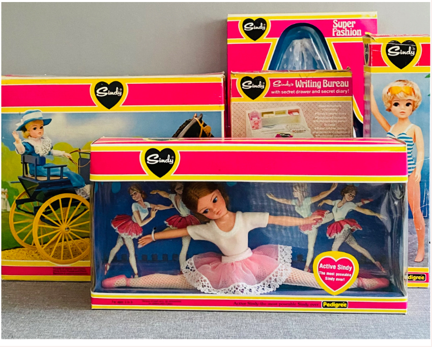
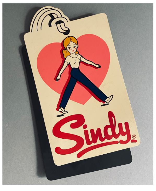
So, for Sindy’s twentieth year, 1983, Pedigree’s range not only included a fashionable line up of dolls, clothes and accessories, but a brand new packaging design, instantly placing Sindy as well and truly heading into the 1980’s and up to the minute! The first big change was the Sindy signature logo itself, it was now in red, with a more fun, rounded, bolder font.
Sindy apart from the rest…
The ‘love heart’ so synonymous with the Sindy brand appeared above it in pink, with a sketch of Sindy herself, striding merrily along!
These updates were contained within a swing tag design, I think to emulate a ‘Designer Label’, for this was the eighties and the era of big names and aspirational living. This set the tone for Sindy being the premium fashion doll against her less tasteful competitors….
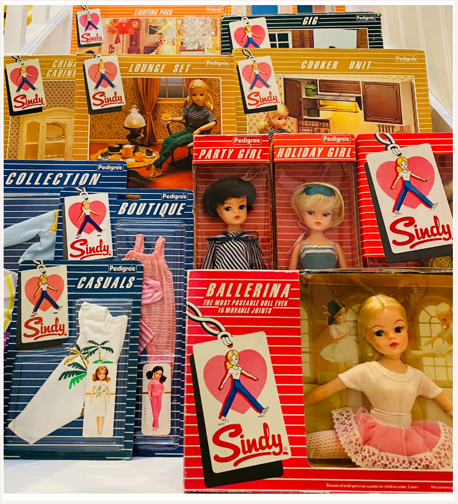
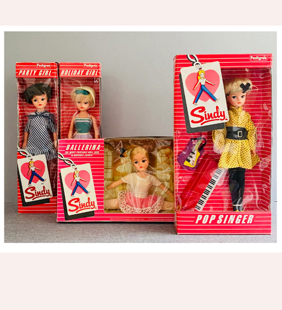
As well as the new logo, all Sindy’s packaging was radically updated. A modern striped design was introduced, which looked very new and trendy at the time. The traditional deep pink was abandoned in favour of a new ‘colour coded’ design.
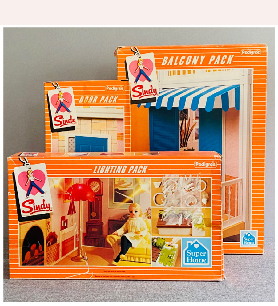
By now the assortment of Sindy products was vast, so different colours were used for different parts of the Sindy range, dolls were in a rose pink box, fashions in blue, furniture in caramel, horses in dark
green, vehicles and outdoor items in turquoise and the new ‘Super Home’ in orange.
This made it easy for retailers to group items together by colour on shop shelves.
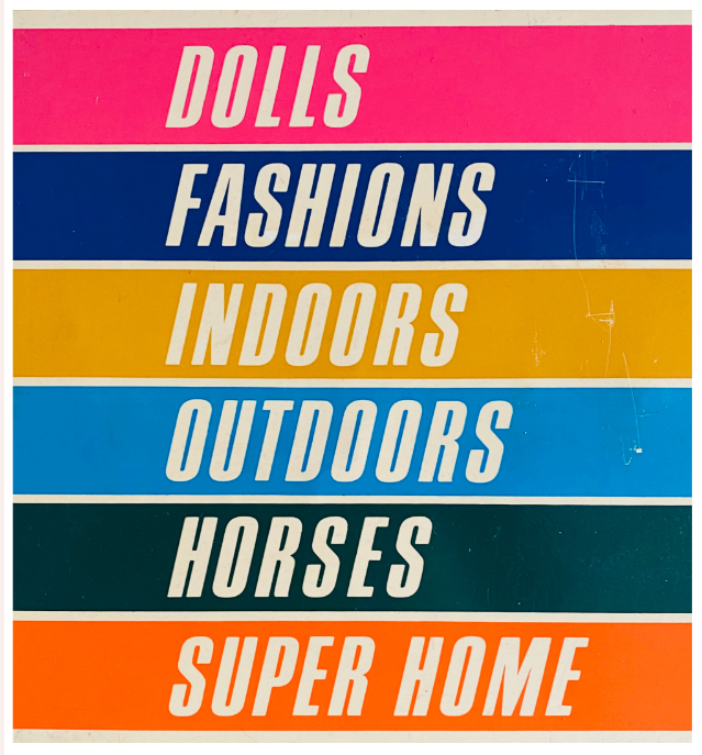
colour coding of Sindy 1983 packaging.
Therefore easier for shoppers to find, for example, all the horse items in the same area, the Super Home items together and so on.
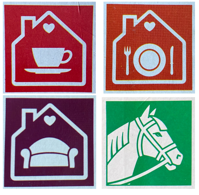
The boxes also had a logo in the bottom right hand corner so for example the kitchen items were linked with a teacup logo, the bathroom items had a bath logo, the horses a horse logo and so on, again this made it easy for retailers to group themed items together when merchandising the product and make them easier to find for customers.
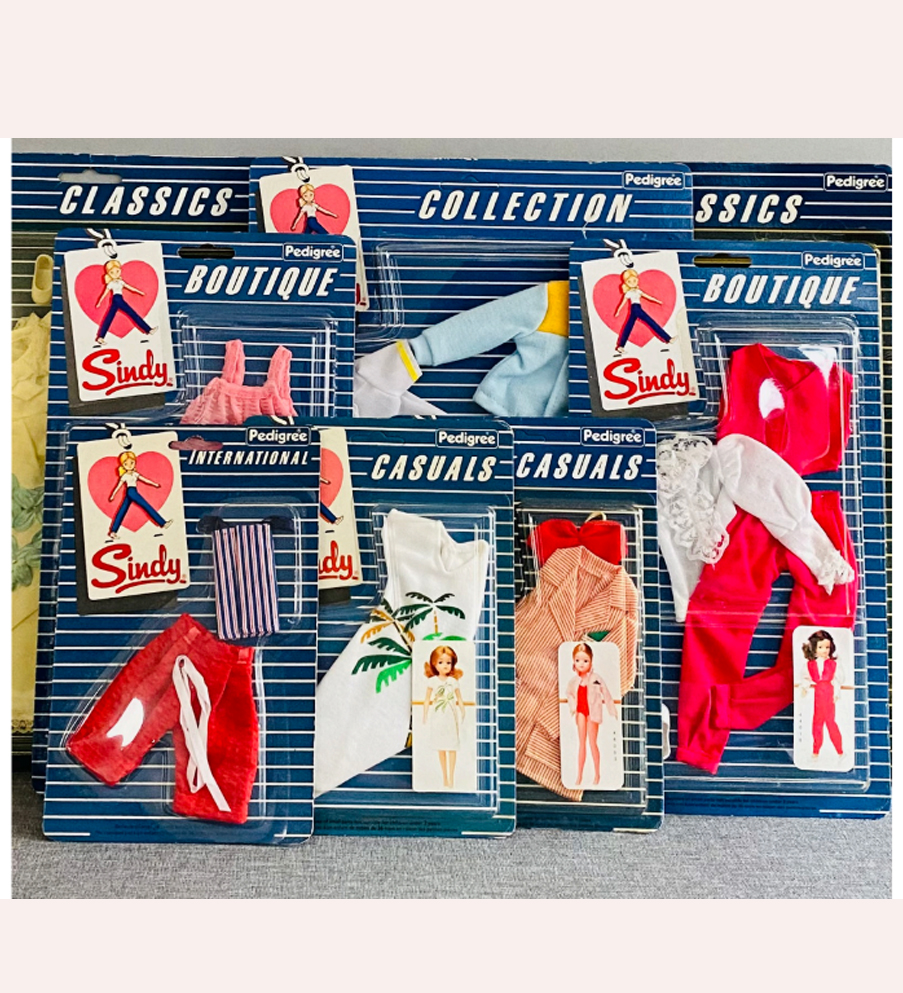
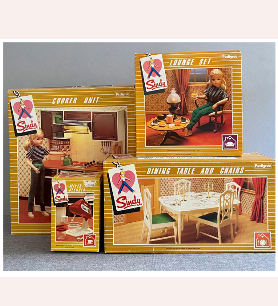
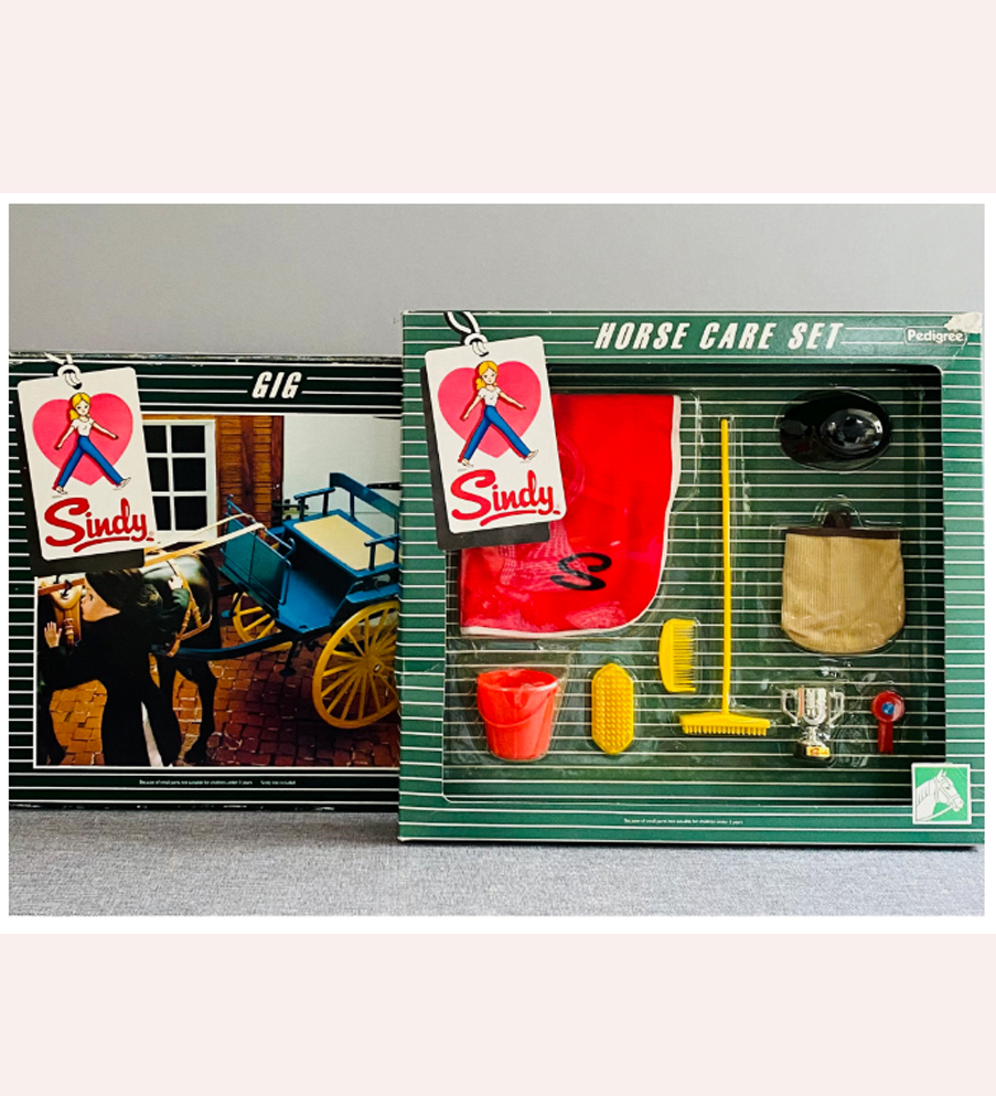
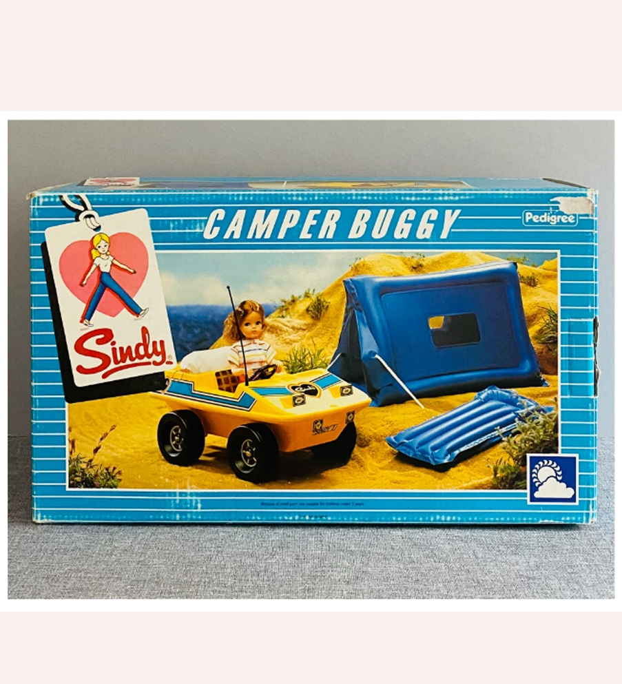
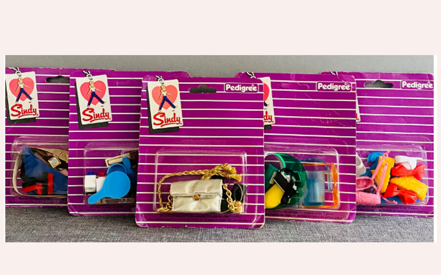
In 1983 Sindy also acquired a range of pocket money priced accessories –
including handbags, shoes, belts etc, these were 95p and sold in a purple striped blister pack.
The new packaging and ranges made Sindy more contemporary – her fashions were much more youthful and in line with actual fashion trends at the time than they perhaps had been for the previous couple of years, and all the photography used for the packaging was done to a high standard, picturing Sindy in realistic settings that fired the imagination.
The rebrand was a success, and more changes followed over the next couple of years.
Sindy 1984 Packaging
In 1984 Sindy continued to shine – and there were some minor amendments to her packaging this year. The dolls were still sold in the rose pink packaging, the fashions in blue, the accessories in purple. However by the middle of the year the multicoloured
boxes of the previous year were amended. The Super Home, and Furniture altered to the same pink as the doll boxes, and the green Equestrian boxes became the same turquoise as the ‘outdoors’ items….
Some of the new items from 1984 can be found in both colour boxes – for example the Hostess Trolley and Wall Unit were new and initially issued in the caramel coloured packaging, later in the year they were in pink boxes. I remember seeing items appearing in the updated colours around summer time that year.
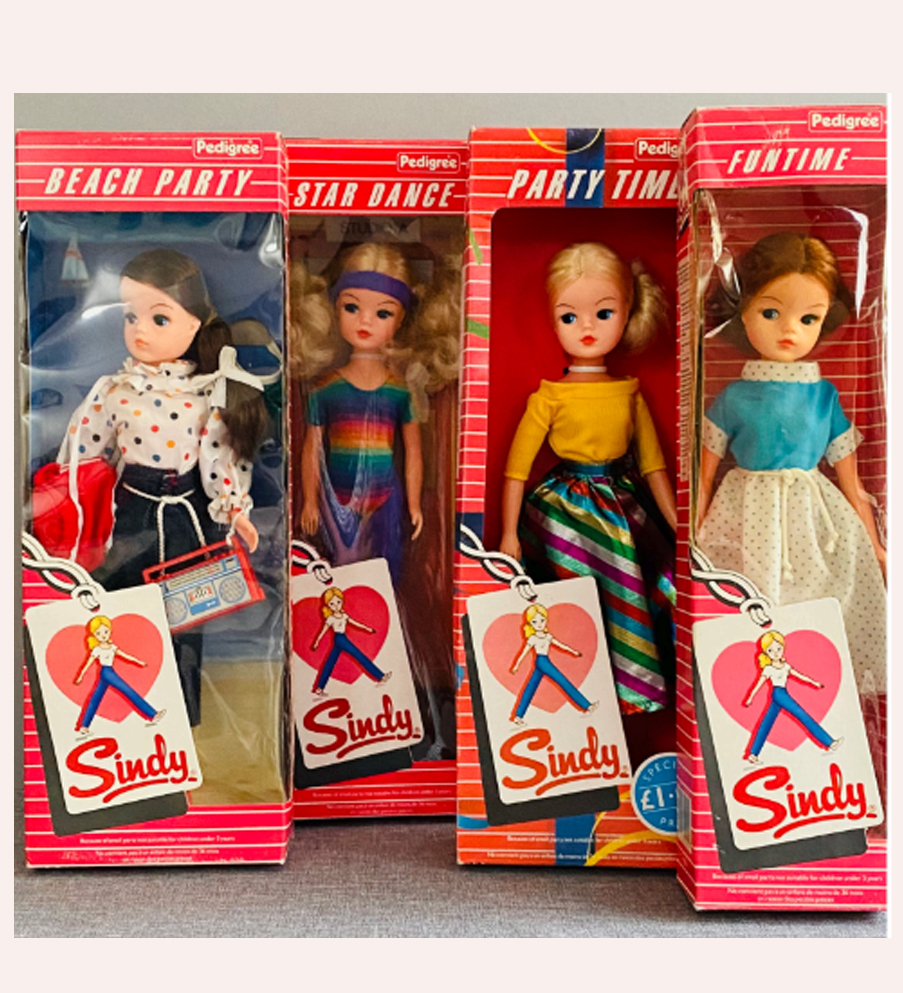
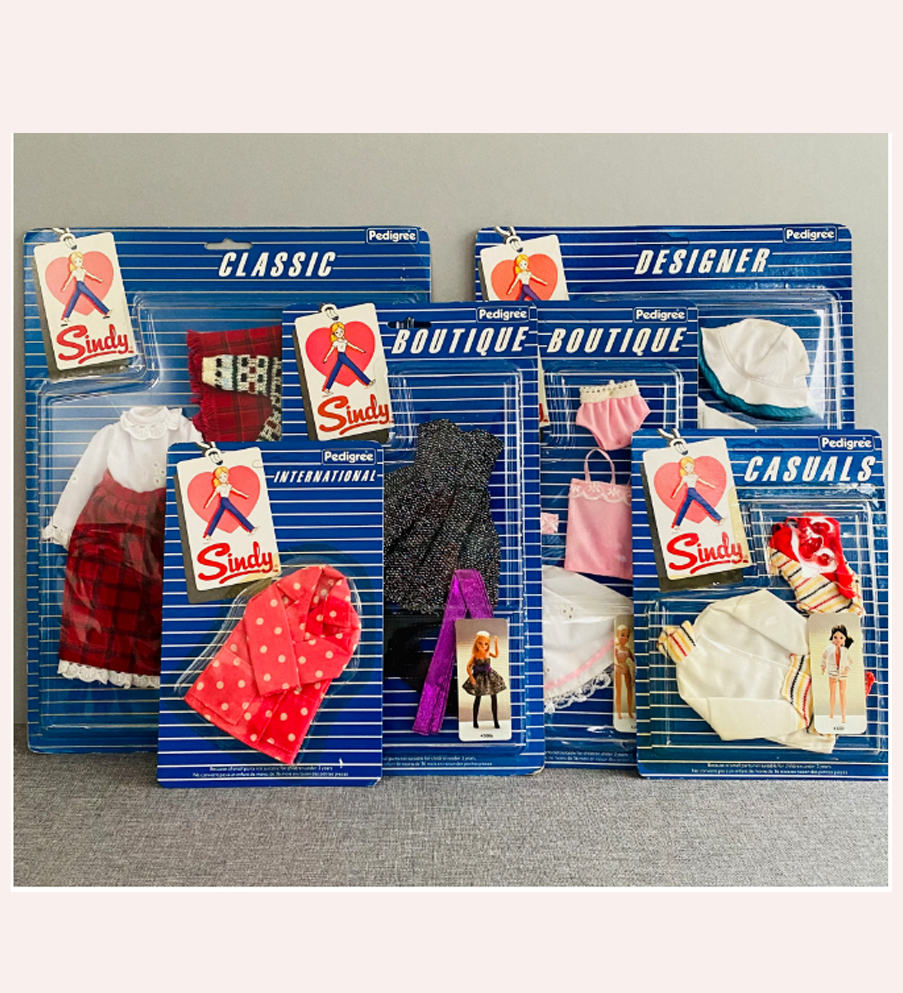
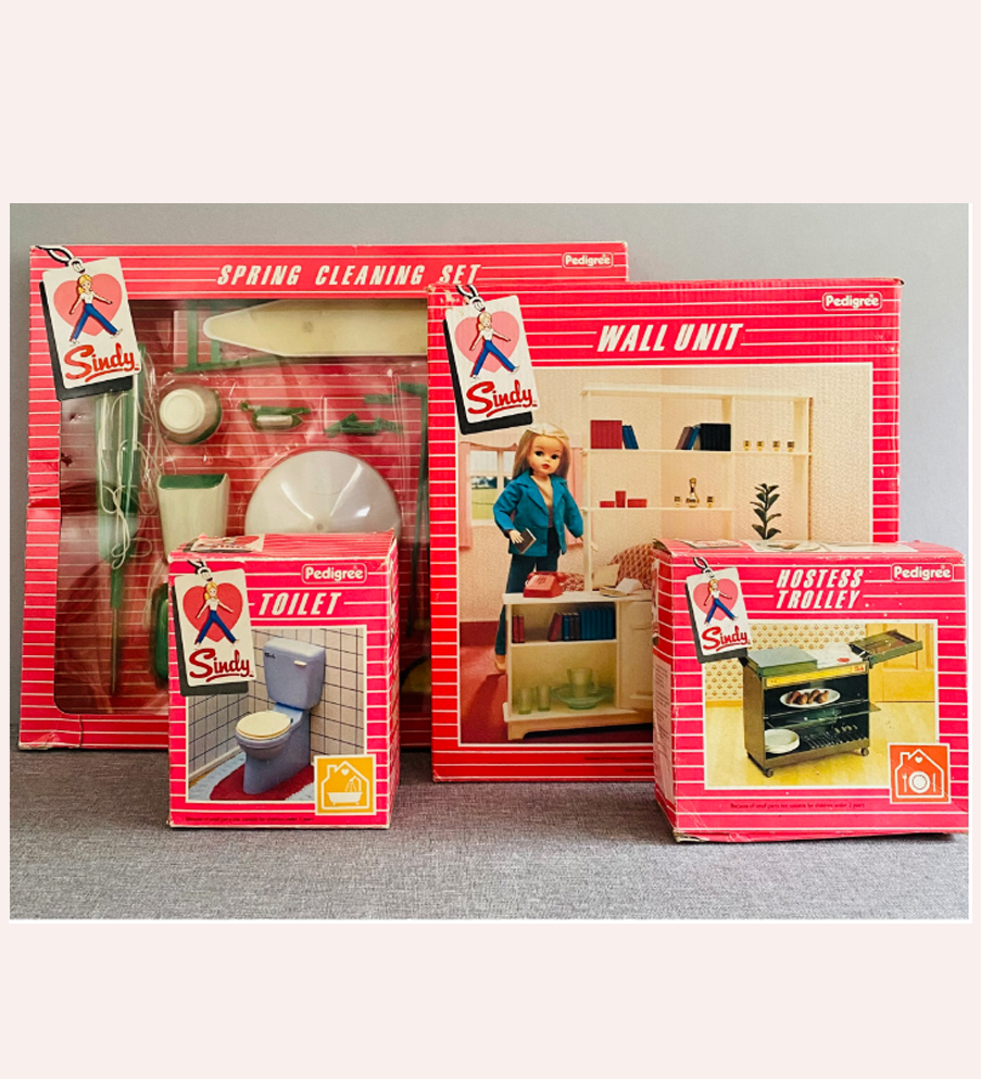
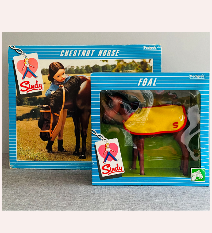
These colour changes seemed sudden, as Sindy had only just rebranded, but having seen what came the following year, Pedigree were going for Turquoise and Pink as their brand colours for 1985, so were amending the current packaging colours in preparation for their new collections.
1985 Sindy Packaging
1984 was a super successful year for Sindy, and Pedigree kept up the momentum with some stunning dolls and accessories for 1985, including a collection of gowns designed by top British designers, David & Elizabeth Emanuel.
Sindy’s packaging was updated again- all dolls, furniture, homes and vehicles were now in a vibrant almost neon pink, with a turquoise graphic panel edged in yellow. The fashions were in the reverse -turquoise with the graphics on pink with yellow edging.
The swing tag logo no longer had a black shadow, it was either blue or pink. The Emanuel Fashions bore the Emanuel Designer label alongside Sindy’s, and the ‘Elegance’ graphics were in a classical typeface on silver grey, in keeping with the Emanuel branding.
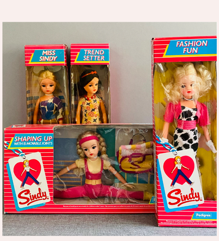
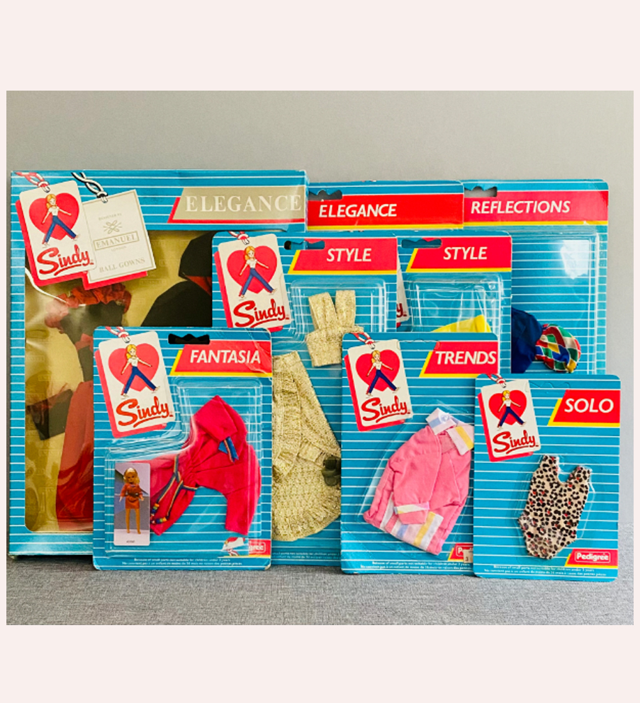
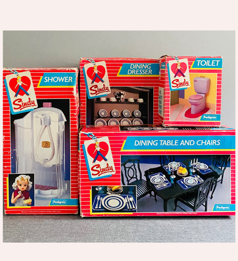
1985 Packaging variant
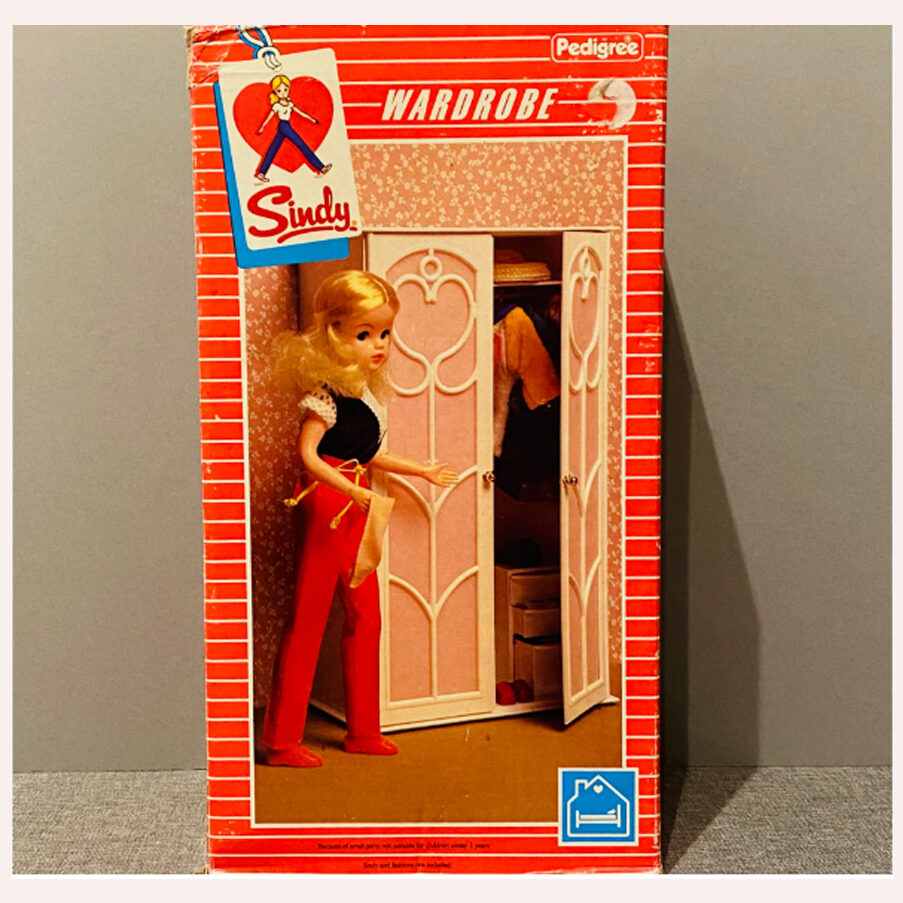
There are some packages that appear to be variants – these appear to be the same as the 1984 pink boxes with with one difference -the shadow beneath the swing tag was in turquoise rather than black. I have found these mainly on the bedroom furniture boxes so far – I have seen the 1984 Bed, Wardrobe, Dressing Table, and Vanity Unit with this turquoise shadow. The title of the items is in the 1984 white typeface rather than a blue panel.
I think perhaps Pedigree only put the brand new 1985 items in to the new branding and just tweaked the colouring on any ongoing items, rather than fully updating all the boxes. They would have been working 1-2 years ahead and by this point and were planning a total makeover of Sindy for 1986 including all packaging, ranges, fashions and Sindy herself.
1986 Sindy Packaging
A big surprise to everyone was the new Sindy, issued in 1986. Pedigree, like many other British toy companies around this time, ceased trading toys this year. Although Sindy had been the jewel in their crown, and her continued success attracted takeover bids from Tonka and Hasbro (the latter taking the reins in 1987), they sadly had not kept up to date with their other products at the time. Their final issue of Sindy appeared early in 1986 with brand new packaging- a misty effect pink box with yellow contrast and an illustration of
Sindy set into a ‘rainbow’ circle.
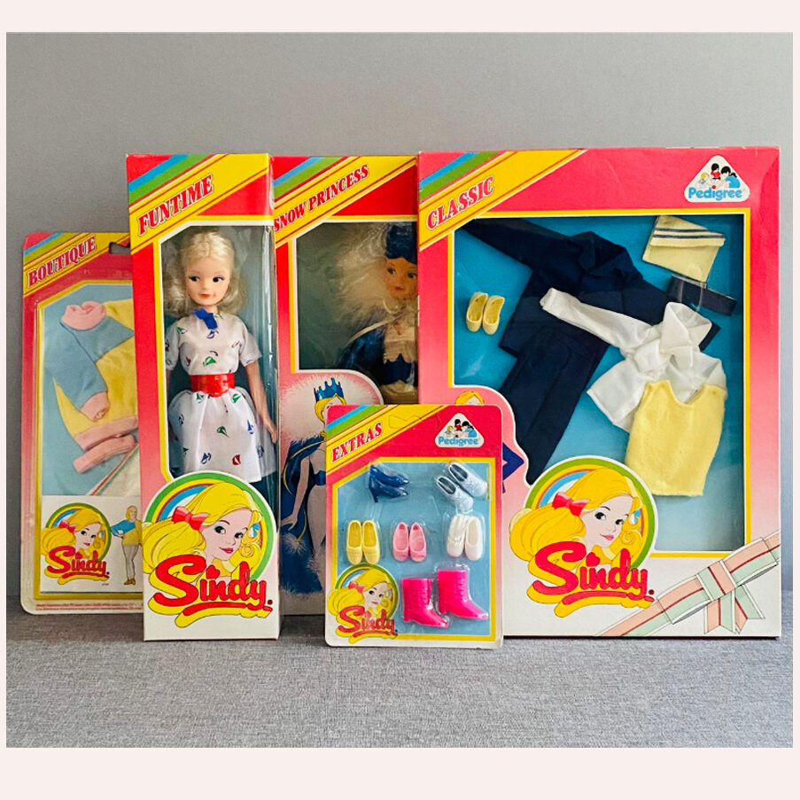
This packaging was updated within the year to a pink and purple version, I remember these purple and pink boxes appearing through summer 1986 and although they were in my opinion nicer than the early 1986 boxes I couldn’t believe the Sindy packaging was
changing AGAIN!!!
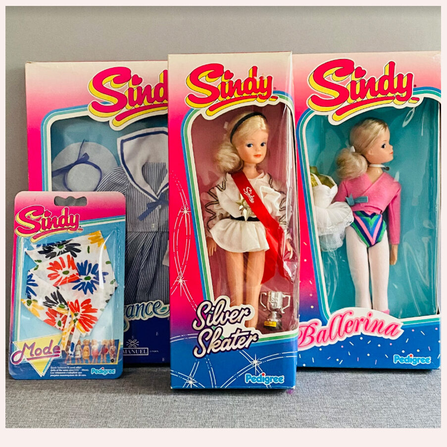
Sindy’s packaging can lead to confusion for collectors these days, as dating items and boxes can seem impossible due to so many differences in the design. I have collected Sindy since the early 1980’s, many items in my collection were bought then, and I remember all the many incarnations, and when they appeared in the shops, so I hope this article and the photos help to clarify what can seem to be a real muddle! I think for me the stripey box
era 1983-85 is my personal favourite as I remember there was quite an impact seeing it in stores, and how modern and cool it seemed at the time. I remember one of my neighbours remarking ‘Sindy’s gone all trendy now hasn’t she..’
So, enjoy identifying and dating your vintage treasures – I hope this helps!“
Thank you so much Matthew Hadley! This helps, for sure!
